Exercises: Represent Data with Plots on the Real Number Line
Work through each section in order. For plots, read carefully: dot plots
show every individual value, histograms group values into intervals (bars
touch), and box plots summarize data with the five-number summary
(minimum, Q1, median, Q3, maximum). Write explanation answers in complete
sentences.
Warm-Up: Reading Data Displays
These problems review reading values and plotting on a number line.
Which type of plot displays every individual data value by placing a dot above its position on a number line, stacking dots when a value repeats?
Dot plot
Histogram
Box plot
Bar graph
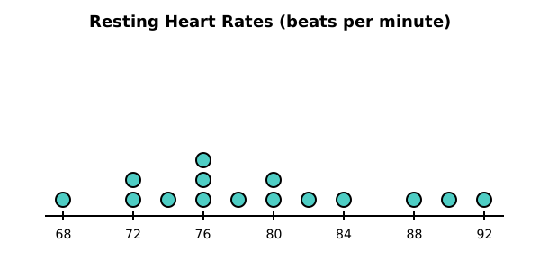
The dot plot below shows the resting heart rates (beats per minute) of 15 students. How many students have a heart rate of 76?
3
1
76
2
A student records hours of sleep for 5 classmates: . To build a dot plot, she lists the values in order. What is the smallest value she should label at the left end of the number line?
Fluency Practice
Read each plot and answer. Use the displayed values.
Use the heart-rate dot plot below (15 students). What is the range of the data (maximum minus minimum)?
A data set of daily high temperatures (in F) for one week is . Using the rule that an outlier lies far from the rest of the data, how many values in this set are unusually far from the others (i.e., are outliers)?
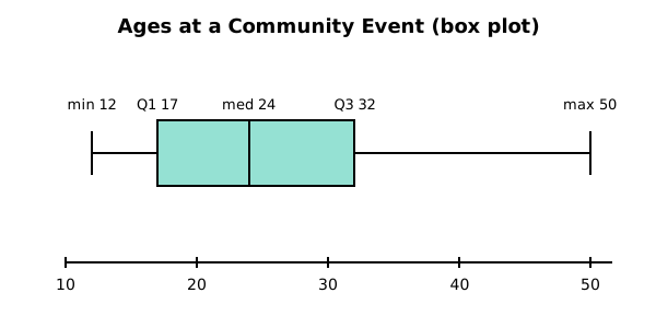
The box plot below shows the ages of people at a community event. What is the median age?
24
31 (halfway between 12 and 50)
17
50
Look again at the box plot of ages (min 12, Q1 17, median 24, Q3 32, max 50). A student says the box plot must be drawn wrong because the median line is not in the center of the box. Which response is correct?
The plot is correct. The median line need not be centered; it sits closer to Q1 here because the lower half of the box (17 to 24) is more compressed than the upper half (24 to 32), indicating right skew.
The student is right; the median line must always split the box into two equal halves.
The plot is wrong because the median should equal the midpoint of Q1 and Q3.
The median line should be at the center of the whole number line.
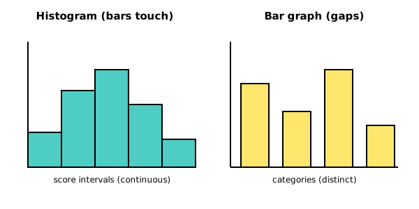
The figure below shows two displays side by side. Which statement correctly distinguishes a histogram from a bar graph?
A histogram shows quantitative data grouped into intervals with bars that touch (no gaps); a bar graph shows categorical data with gaps between bars.
They are the same display; "histogram" and "bar graph" are interchangeable names.
A histogram always has gaps between bars; a bar graph never does.
A bar graph is for quantitative data and a histogram is for categories.
You're viewing 2 of 6 sections.
Create a free account to continue the full exercise set and save your progress.
Create free account